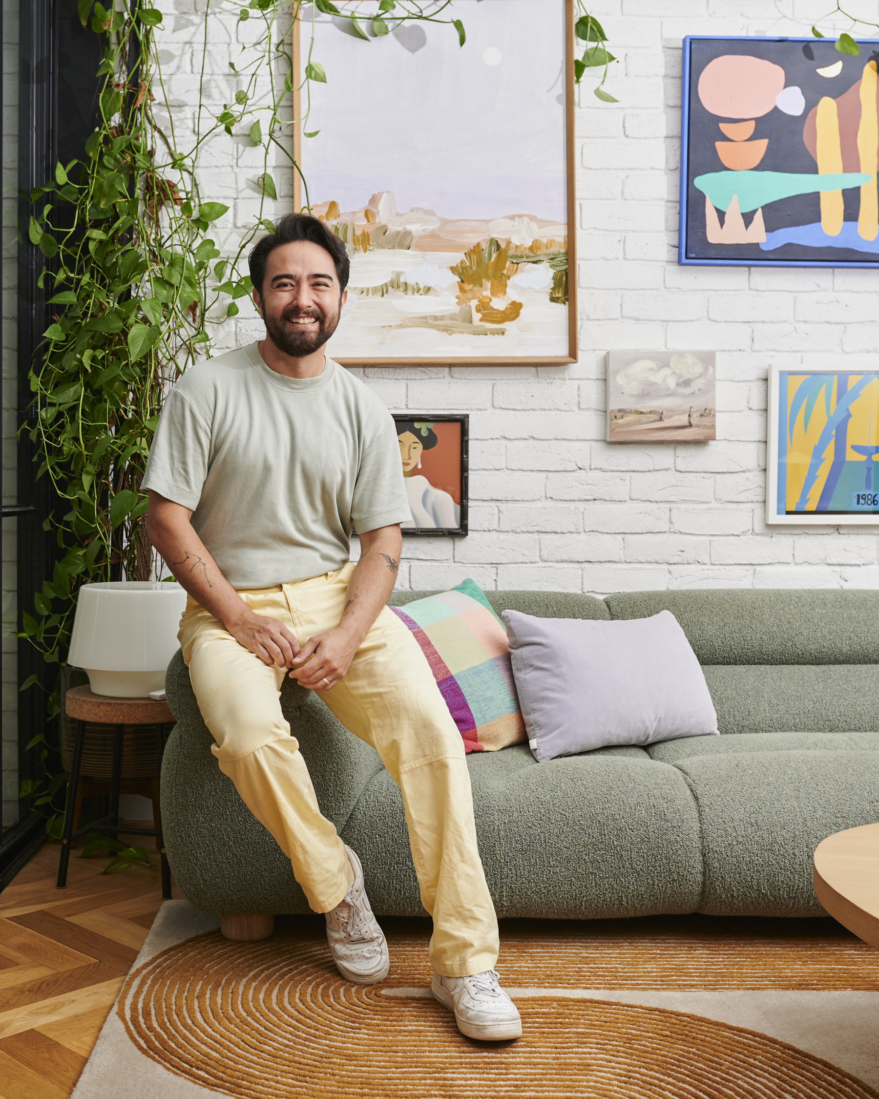
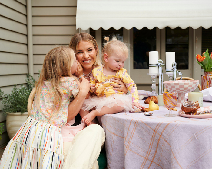
This week on the Home Life Series, we’re lucky enough to visit the home of one of Australia’s leading interior designers, Jono Fleming.
Having made his mark in the design industry 17 years ago, Jono has built his career from the ground up as one of the most adaptable figures in the industry. Renowned for his ability to push the boundaries of interior design, Jono has carved out a unique niche for himself, blending creativity with a keen eye for detail.
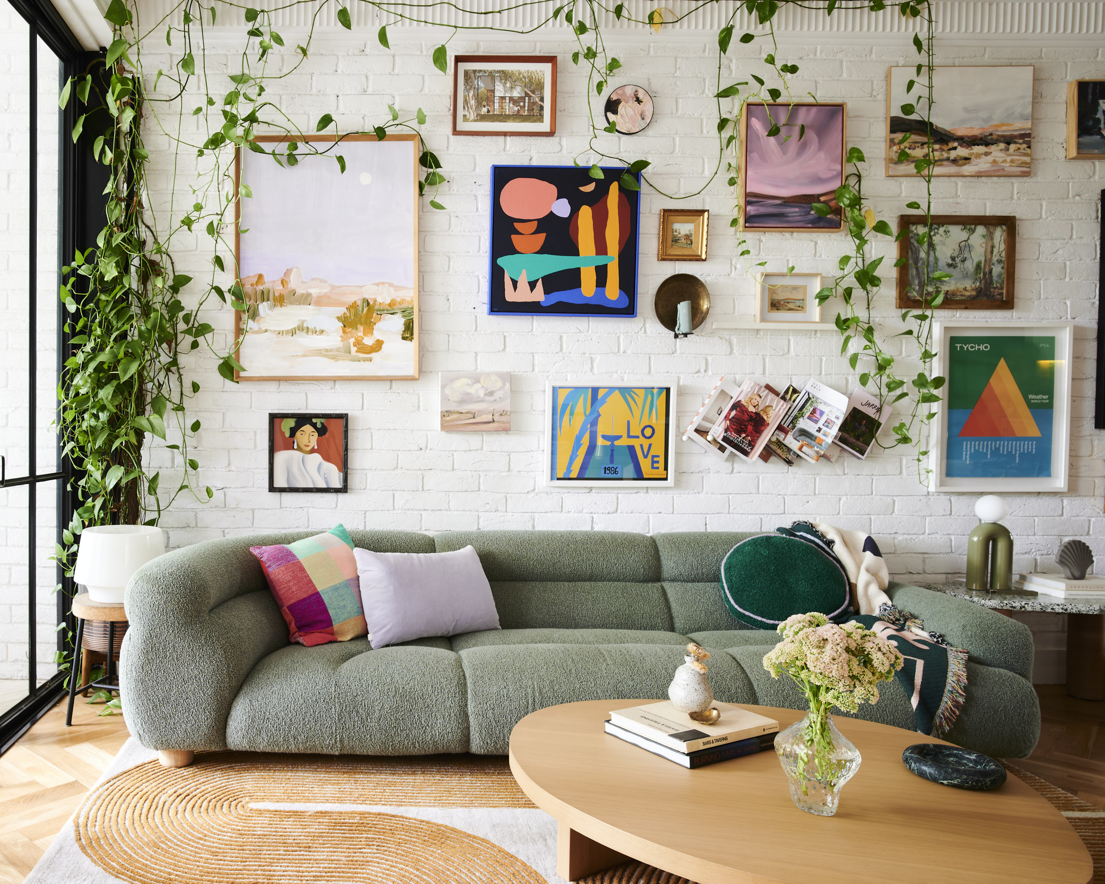
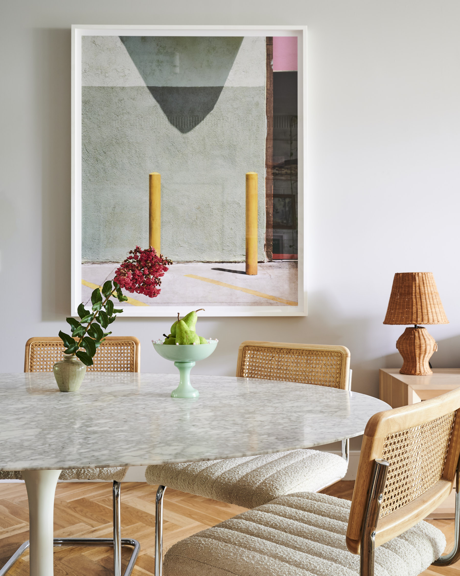
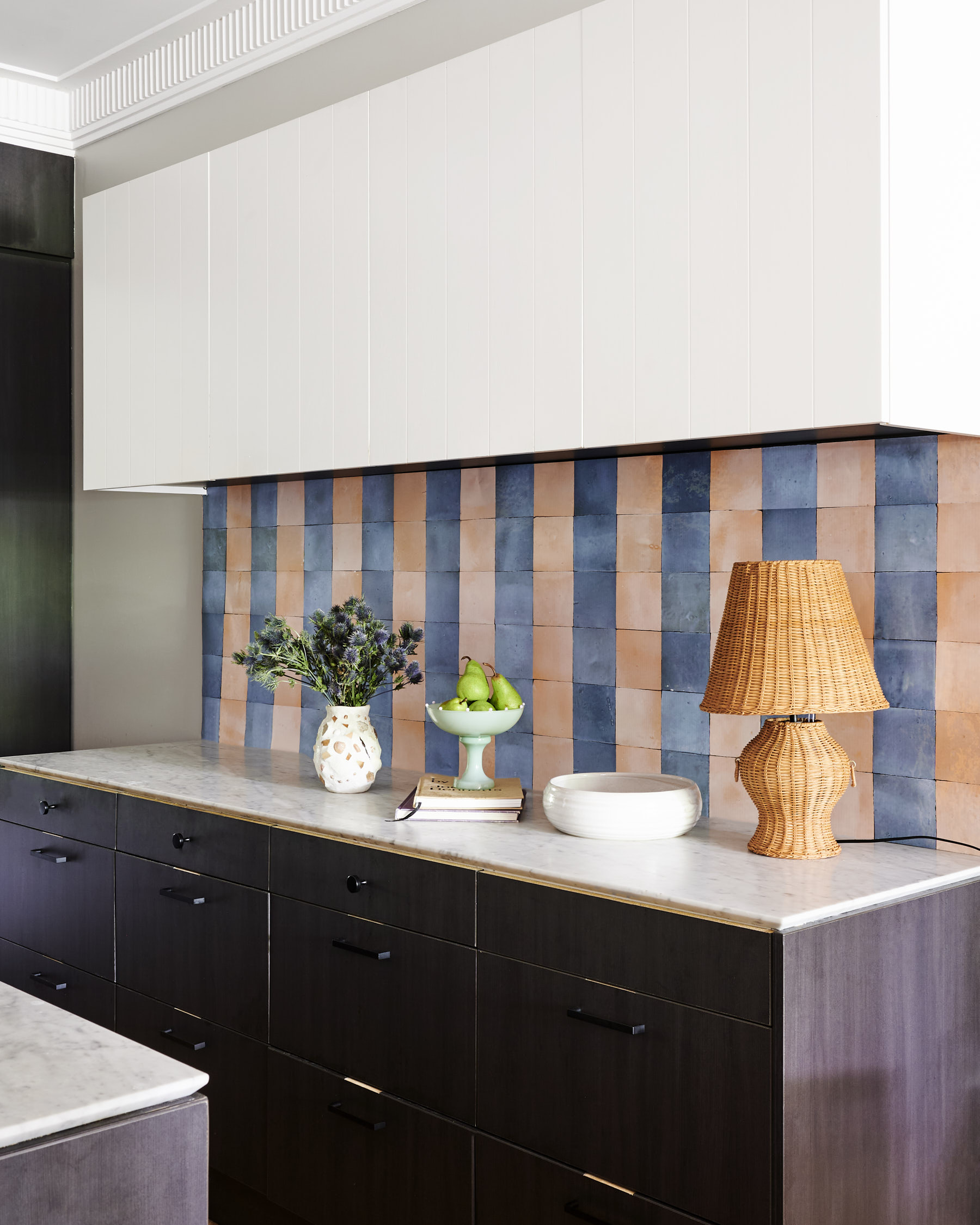
It’s no surprise that his Sydney apartment is an absolute treat for the eyes! From the stunning art gallery wall, to the lush indoor plant sanctuary and a collection of eclectic furnishings, every corner of his home reflects his distinctive style. Keep reading to discover the essence of ‘curated maximalism’ and see how Jono seamlessly integrates bold aesthetics with cosy apartment living.
Hi Jono, we can’t believe we’re finally here to see your amazing space! First up, tell us a little bit about yourself and how you scored this gorgeous space?
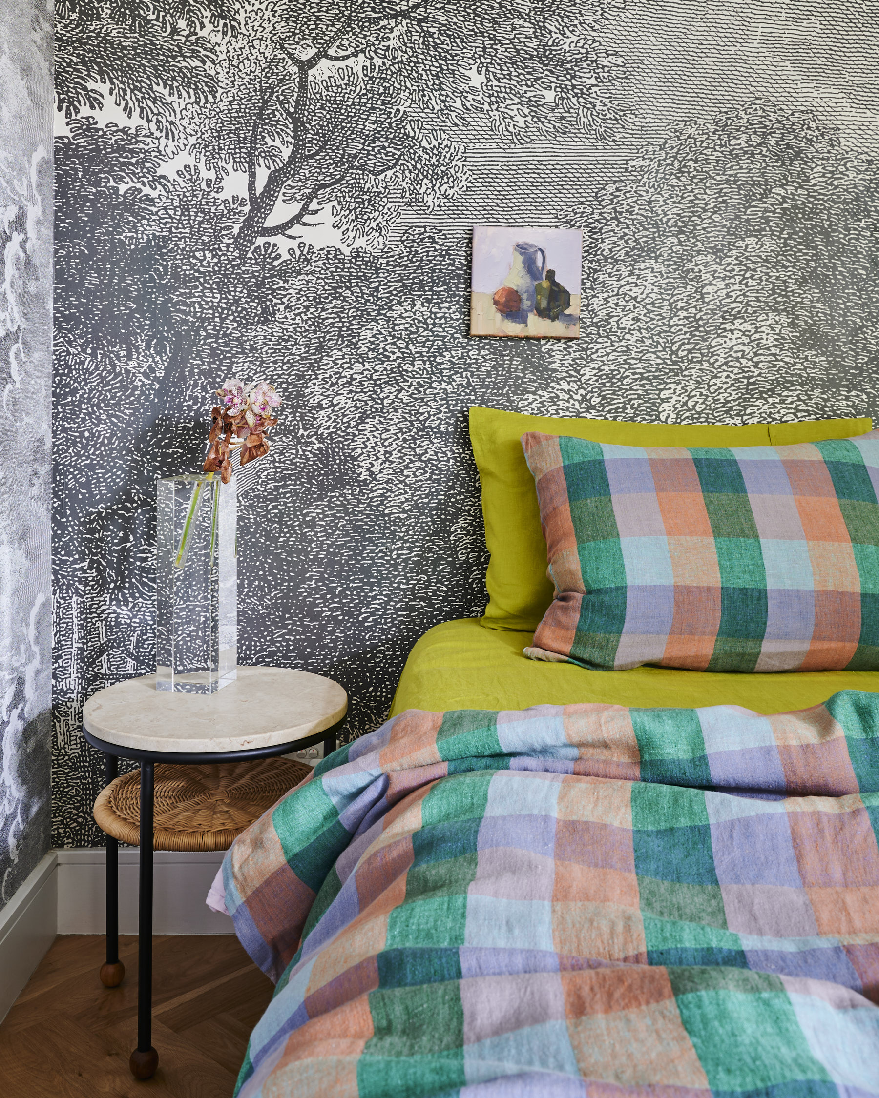
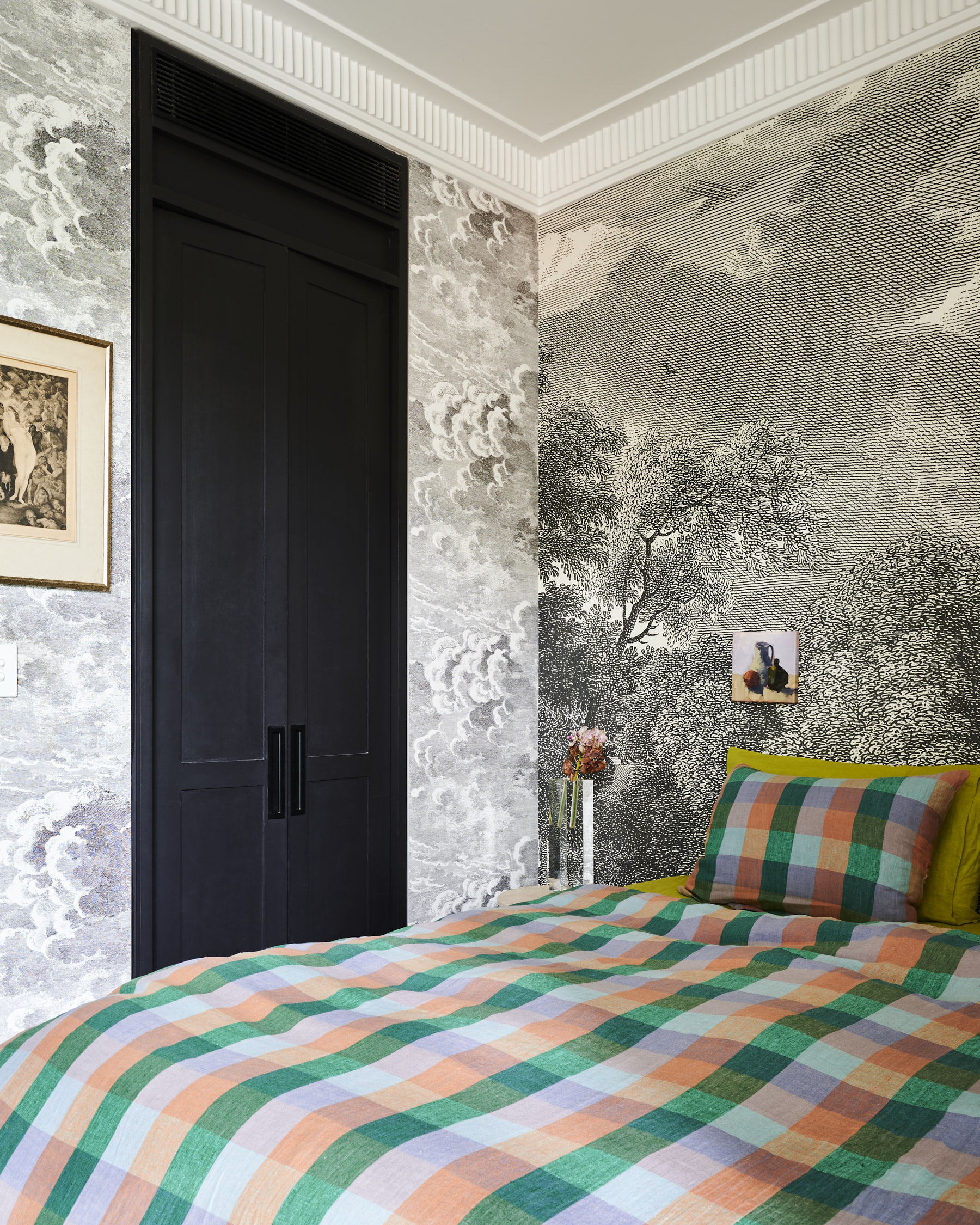
I’ve been in this apartment for about 9 years now, which saying it out loud now, feels like a very long time. It’s evolved over the years, many, many iterations but looking back each era encapsulates where I was as a designer at the time. What I’ve always loved about the space is the details, the intricate cornice, the exposed brick wall, from day one there’s always been so much character in the bones of the building, it’s allowed me to play around and layer my style over the top with ease.
You’re an amazing interior designer, editorial stylist, podcast host AND foodie, can you take us back to the beginning of how your career started?
I’ve been very fortunate to have had a taste of all aspects of the design industry over the last 17 years. I started out teaching design right after I graduated from uni, then worked in some interiors firms before jumping over to food and interior styling. A few years styling in e-commerce then led to my time as Style Editor at Inside Out where I gained a real insight into the world of publishing, trends, and all things editorial. From there I started my own design studio where I am today, doing a bit of everything I’ve learnt along the way, as well as the occasional travel presenting on the telly. It’s a big mix, no two days are the same but it keeps my creativity and passion for design alive and well, if not a tiny bit exhausted.
Constantly exposed to new aesthetics, trends and creative concepts every day must be overwhelming (and exciting/inspiring)! How did you use your knowledge in the interior biz to approach the styling of your apartment?
It can be a touch overwhelming at times but I’ve learnt to edit and be really disciplined about what I bring into my space over the years. That’s not to say I’m not allowed an impulse purchase here and there but I think I know what’s a necessity now and what’s maybe a spur of the moment thing I’ll come to regret later. What’s key is knowing what goes in my space, what balances what I already own and what will be used and compliment the existing pieces. I like to make sure everything gets used, multiple ways if possible. A platter can be for decorative purposes but will also be used during the week for serving dinner for example. Nothing is really purely decorative if I can help it, I want the pieces in my home to tell a story, to be part of our everyday life.
How would you currently describe your interior aesthetic?
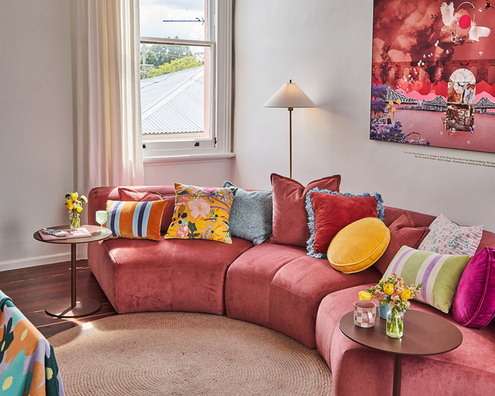
I’m currently sitting in the space of ‘curated maximalism’. The key word here however is curated, maximalism alone can be a touch overwhelming in a space, especially a smaller apartment. The curation comes into play through colour, texture and knowing when to balance these with a pop of pattern and quirk. My gallery wall does a lot of the heavy lifting but it’s constantly changing and evolving, allowing the space to feel fresh whenever it needs an energy shift.
You’ve done an incredible job at making your inner-city Sydney apartment feel spacious and homely. What tips do you have for creating clever, yet curated, multifunctional living spaces?
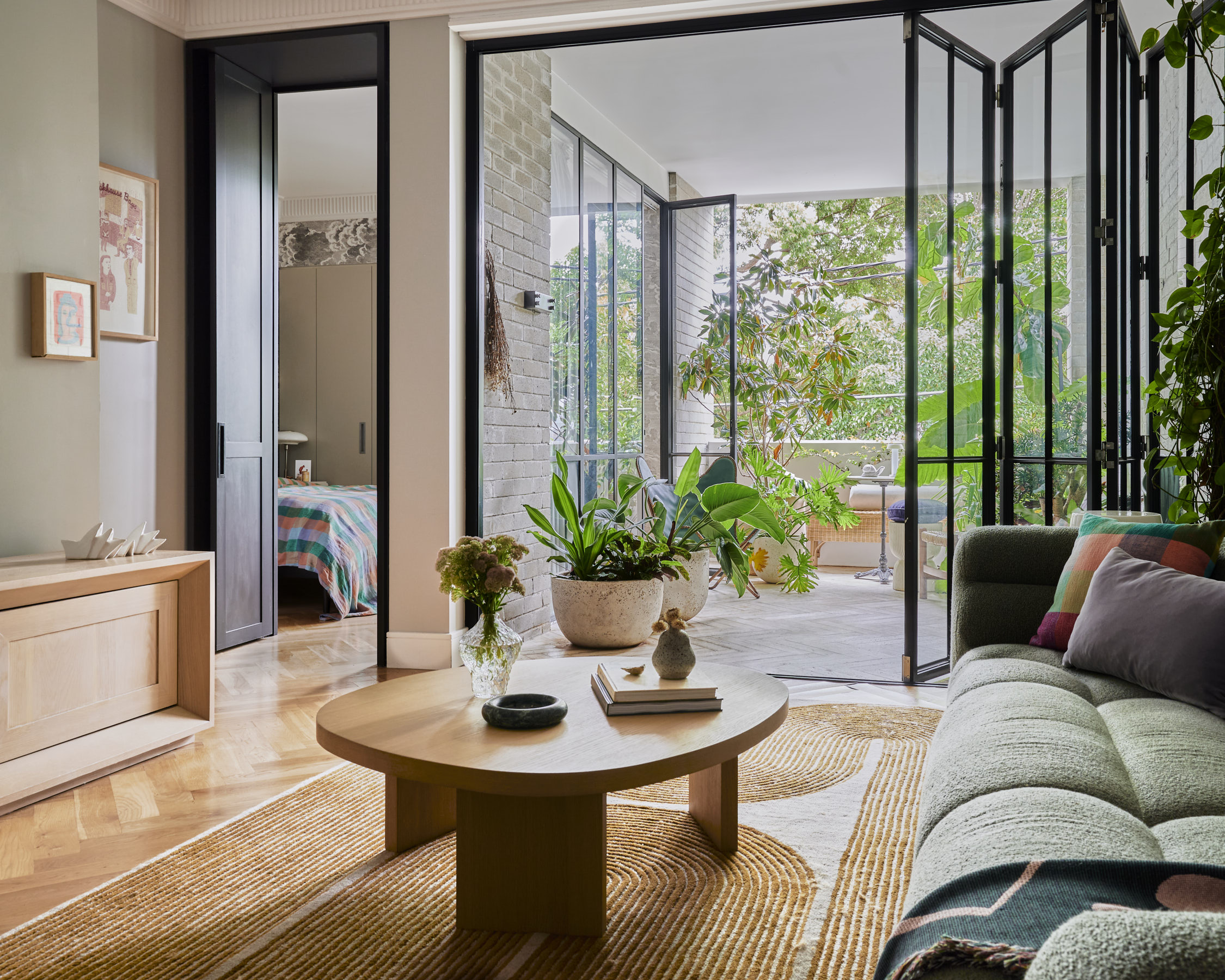
I think what helps tie this space together is the use of colour and points of interest. Whilst there appears to be a lot happening, the grounding element is the beautiful sofa in the oregano boucle. The organic shape and curve of the end helps guide your eye around that room, looping it back in and softening the edge of the space. The devil’s ivy that’s wound its way up the wall also adds a soft natural element to the room, allowing the tendrils to fall organically as they please. I’ve got plenty of storage to hide mess and objects which also allows me to display the things I want, without having too much clutter. It’s all about finding the balance between what’s too much and what’s just enough.
Your recent trip to Morocco had us in all states of FOMO - we can imagine the platter of colour, design and pattern that was handed to you! How do trips like this inform your creativity process and what can we expect to see filter through in our part of the world soon?
A country like Morocco is so steeped in tradition and craftsmanship that has stood the test of time. From woven bags to hand cut tiles, it’s a visual smorgasbord and can even be a tad overwhelming at a first glance. But once your eyes start to settle, it all falls into place and you become enamoured with all the city and souks have to offer. We’ve seen zellige tiles trend in full force over the last few years but one thing unique to Marrakech is their Beldi glass, blown on site at the Beldi country club. These beautiful pieces come in every shape, size and colour and make for an heirloom piece you can keep for a very long time.
