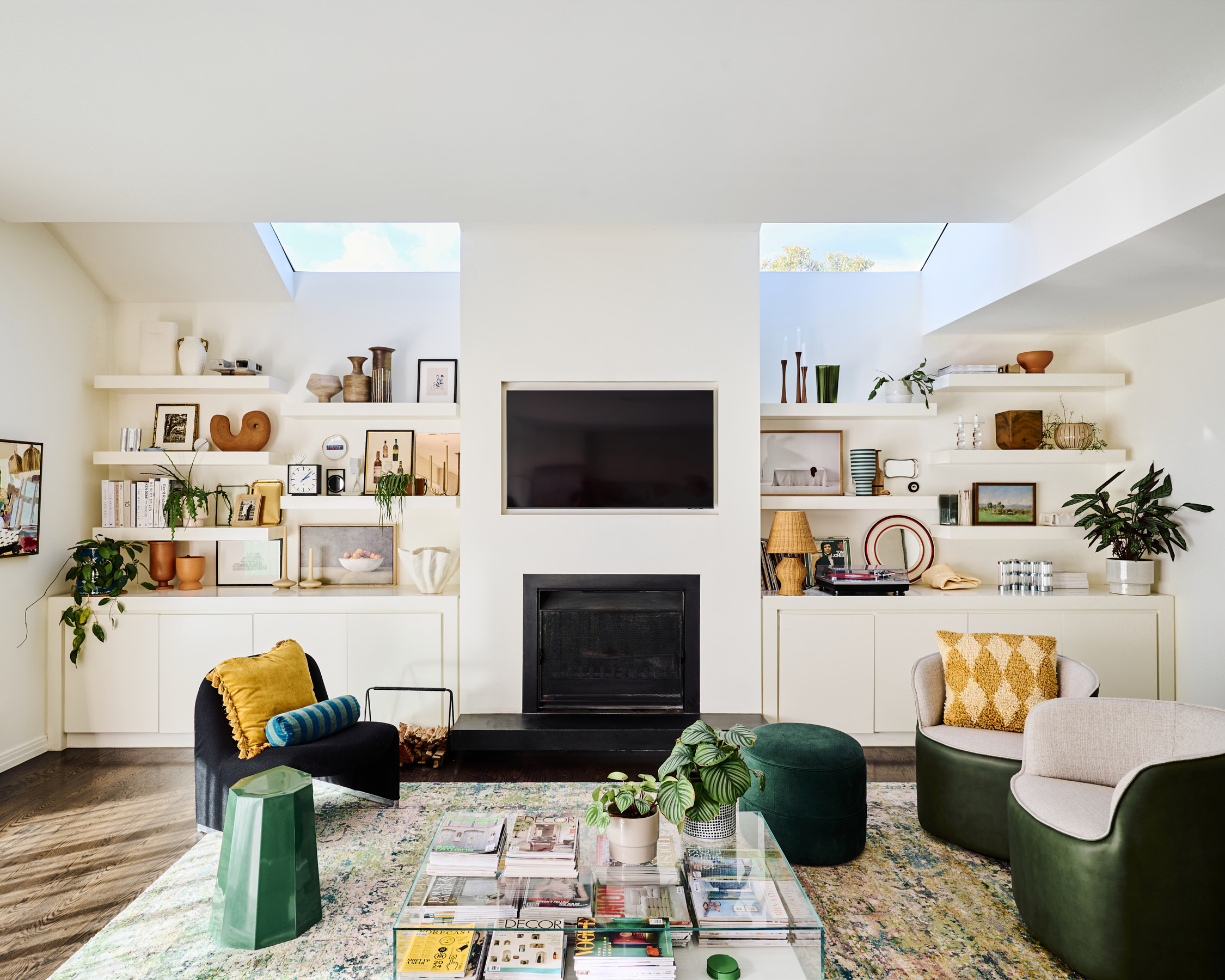
Step into the home of interior stylist and decorator Bea Lambos, of Bea+Co, and you’ll be met with a kaleidoscope of colours, art, and quirky treasures collected over the years. Each room is a delightful mix of vibrant hues and unique relics, showcasing Bea's ever-evolving creativity and her knack for blending the old with the new. Her home is a true reflection of her adventurous spirit, where every corner tells a story and every piece has its own tale to tell.
We had the pleasure of chatting with Bea about the latest interior trends, her sources of unique inspiration, and her top tips for styling your living space. From crafting stunning table settings to mixing bedding prints for a timeless look, Bea shares her expert advice on creating a home that’s both beautiful and enduring.
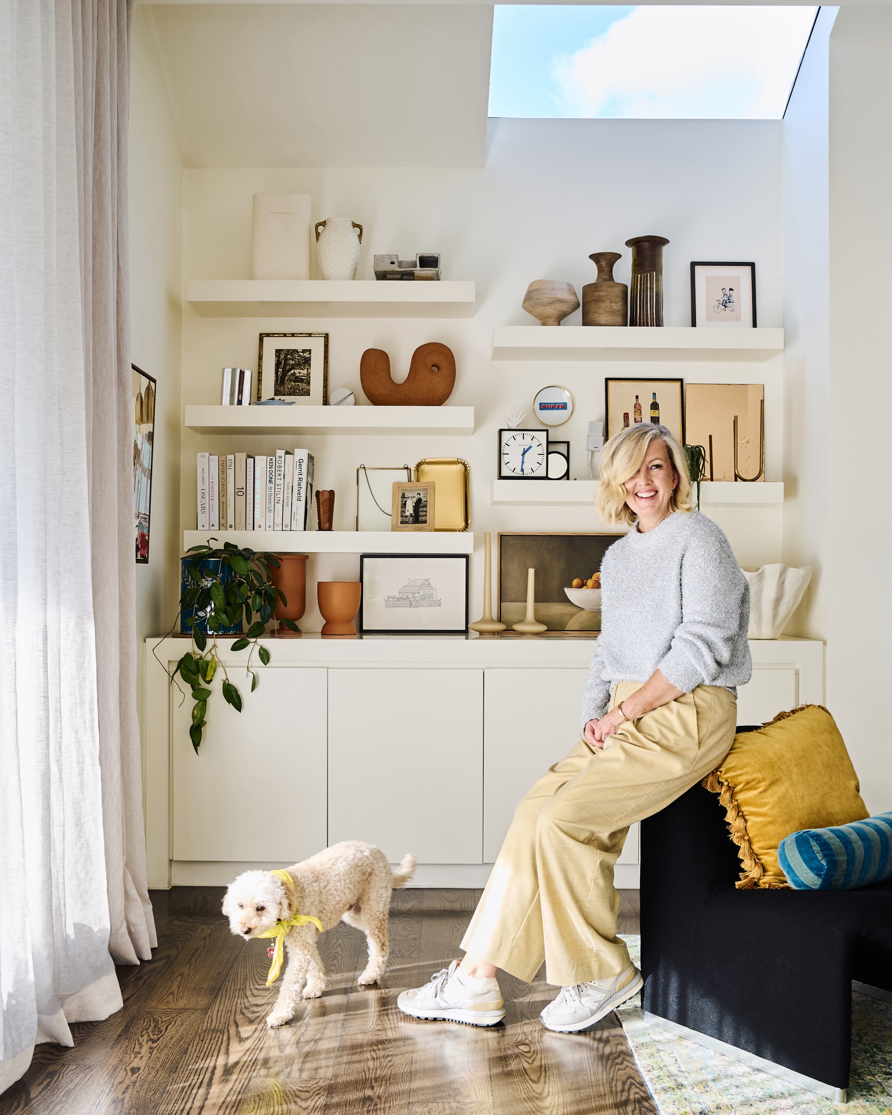
Hi Bea! As an incredible interior decorator and stylist, and the founder and creative director of Bea+Co, can you take us back to the beginning and share how your career started?
There has always been a love for styling and interiors bubbling in me.
I have worked in a few different industries but was always drawn to home and the process of making spaces feel good. I decided to take the leap a few years ago and while I did a course at Design School, I did different workshops in the creative industry and worked with my first client assisting with furniture and object procurement. It was a busy start to Bea + Co, but it gave me the chance to cement what I already knew, articulate to clients what I felt was important in their homes and projects and the ability to network my heart out. I knew that I was drawn to the layers of a home, and the idea of ‘adding the final layer’ evolved.
Being a stylist, it’s no surprise your Malvern home is easy on the eyes! Can you tell us how the home as evolved since your first purchased it?
There were three things that made me fall in love with our house when my husband and I first went to an open for inspection. The incredible natural light in the house was the instant drawcard - the rooms on both levels were so well designed. Secondly, the old owners had a collection of Richard Stringer ceramic bees on the wall of the hallway and I replicated this when we moved in - surely with a name like Bea this was a sign? And lucky last, the interior shelving of my walk-in wardrobe is hot Barbie pink. It makes me happy opening it every day!
We were lucky as we loved the layout and the hard finishes, so since we moved in, we have really enjoyed adding the layers to make it feel like us - painting walls, installing new blinds and sheers, refiguring some rooms, installing loads of art and maintaining the established garden.
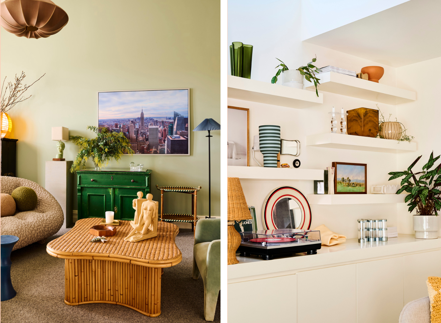
Your home perfectly balances sophistication and style with a warm, inviting atmosphere. Do you have any tips for those wanting to nail this sweet combination but are unsure how? And how do you describe your interior aesthetic?
To be honest, I am unsure how to describe my aesthetic because I love so many styles and genres and get drawn to so many styles when I am sourcing for clients or selecting for my own home. The tips that I can recommend in any space is great lighting (natural or mood rather than overhead task lighting), well balanced furniture that is a mix of shape and texture that fits the purpose of the room and its users and make it smell great - nothing better than walking into a room that is fragrant!
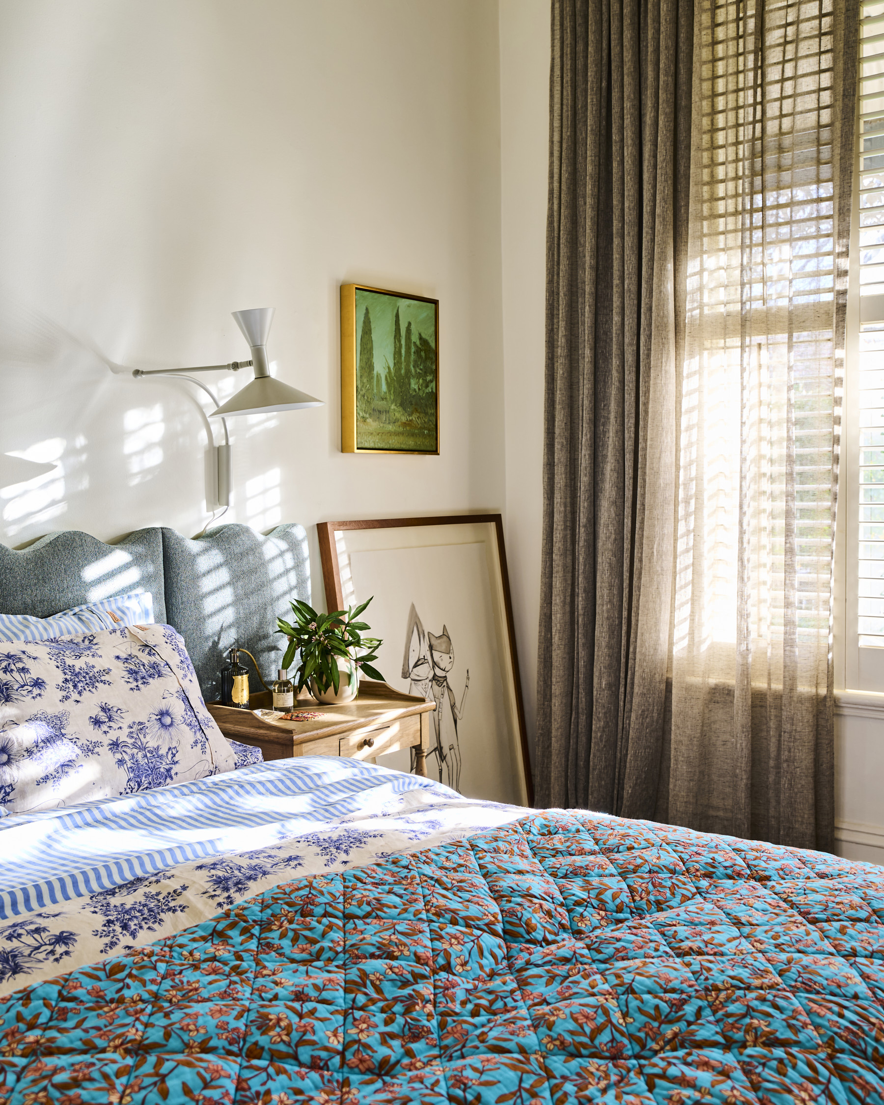
We’re in love with your choice of bedding for the master bedroom! Talk us through your decision behind this blue-toned mix that balances florals and stripes so perfectly?
With an undying love for green, I love the challenge of finding another shade for my spaces at home. These tones feel fresh against the green bedhead and valance and compliment them so well. I love mixing patterns like stripes and florals and once you get adventurous with doing this you can get so many more combinations with the bedding that you own! Whether it is a winter or summer bed, go with layers to make your bed feel luxurious, plump, easy to make and the spot where you look forward to resting, especially on a weekend! Can I add that a Saturday siesta is so perfect here?
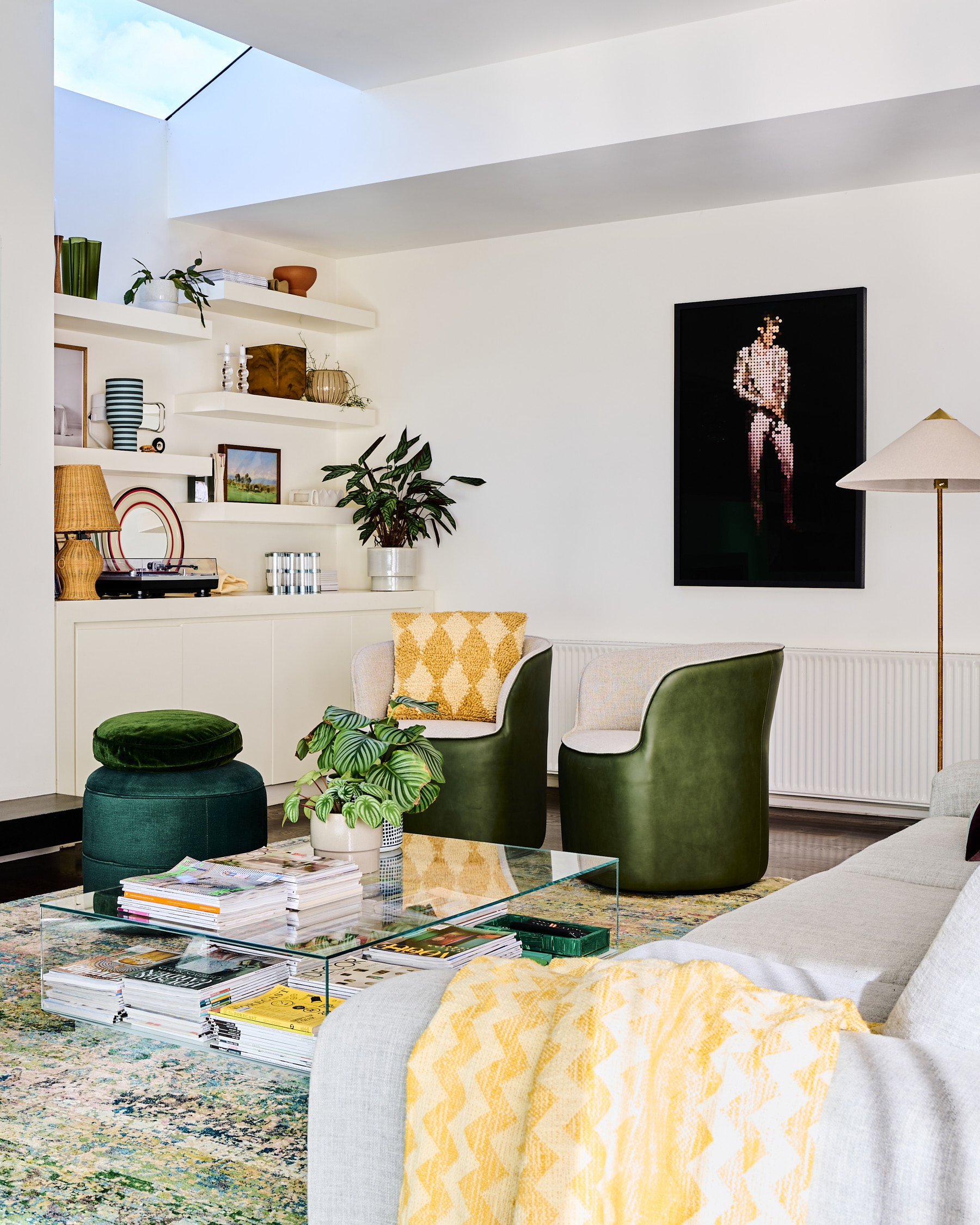
Styling a living room can be challenging, but you've really nailed it with yours! The feature wall, artwork, and decor are all spot-on! How did you decide on the palette and decor for this space?
The warm white built-in shelves are the heroes in this living space. In Winter, and when we tend to congregate around the fire and TV, they are laden with collected and treasured pieces of artwork, ceramics and shiny silver and gold. I’m not much of a TV watcher so while the family sits I can be found shuffling and admiring! In Summer I tend to pare these back, open up our mighty sliding door and let our garden and pool be the feature. When we first moved in I vowed that I would paint the white walls so I concentrated on adding color with the rug, sofa and armchairs until I could decide on a shade. But now I love the negative space and will hold off for color, for now anyway!
-v1723092974937.png)
Whether the weather calls for indoor entertaining or alfresco dining, entertaining staples tend to stay the same. What are your three non-negotiables when it comes to hosting the perfect get-together?
My ethos is the perfect setting is as much about what you eat as it is about where you eat. A well dressed table inside or out needs layers - think linen tablecloth and napkins, something live in a vessel whether it is floral, herb or branch and definitely make sure there is a space for candles or a table lamp for evening. If the room makes your guests feel good, then you are already halfway there to a great meal!
We love following you for your styling inspiration, but who do YOU love following for some inspo?
There are so many people that I love to live vicariously through on Instagram and in print. I count myself so freaking lucky to work alongside some incredibly talented people! But if you are seeking beauty from near or afar, my favorites right now, in no particular order, are
- French photographer Romain Laprade (@romainlaprade) - he has an incredible way of seeing the world.
- UK Interior Designer Studio Ashby (@sisterbystudioashby) - they have a beautiful way of mixing contemporary and traditional architecture and design elements into their projects
- US artist Michael McGregor (@themcgregor) - for his whimsy artworks created with hotel stationary from around the globe.
As much as I love social media and creating and sharing imagery, I find that a walk in a new hood, an unrushed meander through a gallery and a long mooch in a bookstore or newsagent also provide so much inspo for my work at Bea + Co.
With your wealth of knowledge and finger on the pulse for all things interiors, what are the key interior trends we should expect to see in homes and spaces this Spring / Summer?
My tips for any client is to get off socials when they are searching for pieces and ideas for their homes. Instead head to magazines and books from Australia and overseas for more diversity in color, finishes, furniture and decor. Things that I would love to see in Spring Summer are warm tones like butter yellow and golden brown on walls and other soft and hard finishes. That pop of red we have been digging in fashion is also a mighty prospect for homes. Shiny is delicious and back in a big way - chrome tapware, furniture and in soft furnishings. Tone on tone or color drenching is the easiest way to choose color (only one choice is perfect!) and get maximum impact in a room - recycled blue denim in everything - sofas, curtains and bed linen is in my sights!
-v1723093583099.png)


